I want to start with the honest bit, which is that I got these tapestries home, stood them against the wall, and thought: what have you done.
Three framed needleworks. Three pounds each, near enough. Somebody’s grandmother sat and stitched every one of them, flowers, all of them, which is of course why I bought them, because I am incapable of walking past a flower and they were lovely under the glass.
The frames were not lovely.
What was actually wrong with them
Nothing, individually. That’s the trap.
They were fine. Perfectly decent wooden frames, the sort of thing that came free with the picture in 1974 and has been doing its job quietly ever since. Brown-ish. Orange-ish. That particular tired varnished pine that goes the colour of weak tea. Nothing you could point at and call ugly.
But together, on a wall, they looked like three unrelated things that had been put in the same place by accident. Which is precisely what they were.
I left them leaning against the skirting board in the hall for; I’m going to say a fortnight, but it was longer while I walked past them several times a day feeling faintly embarrassed about the whole business.
The bit where I stopped trying to match them
Here’s the thing I’d have got wrong a few years ago: I’d have painted all three the same colour.
It seems like the obvious answer, doesn’t it. Mismatched frames, one tin of paint, problem solved. And it does work, in a flat sort of way. You end up with three matching frames and a wall that looks like a set.
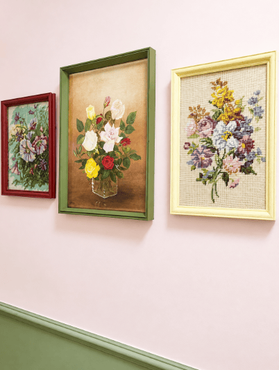
What I did instead was paint each one a different colour and then pull those colours from things already in the room.
The green is the same green as the skirting board and the dado. That’s the one doing the heavy lifting. Because the middle frame matches the woodwork, your eye reads the whole wall as one deliberate scheme rather than three pictures that happen to be hanging near each other.
The deep red picks up the roses in the stitching. The pale buttery yellow picks up the yellow flowers in the one on the right, and it’s soft enough to almost disappear into the pink wall, which makes that picture feel like it’s floating.
Three different colours. One conversation.
Paints used: FRAME 1: Maroon no 715, Wickes · FRAME 2: Bancha no 298, Estate Emulsion, Farrow & Ball· FRAME 3: Mustard Jar, Crown · Walls in Middleton Pink, Farrow and Ball and Green shade 5, Valspar
How I actually did it
Nothing clever, and no specialist kit.
Take the picture out. All of it glass, backing, the needlework itself. Don’t paint around anything, and don’t be tempted to just mask the glass. It never looks right and you will see the edge forever.
Give it a scuff. A light going-over with fine sandpaper. You’re not stripping it back, you’re just taking the shine off so the paint has something to grip. Five minutes a frame.
Wipe the dust off. Damp cloth, then let it dry properly. This is the step everyone skips and then wonders why the paint went bitty.
Two thin coats, not one thick one. Thin coats every time. A thick coat sags in the corners and takes a week to stop being tacky.
Put it back together and clean the glass properly — inside and out. Sixty years of somebody’s front room comes off the inside of that glass and the difference is genuinely startling.
I used tester pots for all of this, which is the whole reason this project cost almost nothing. I have a small architectural stack of them by the window, samples, leftovers, tiny tins from things I painted years ago and there’s more than enough paint in a tester pot to do a picture frame twice over. Some of these frames were painted with something I already had.
I hung them, stood back, and said something out loud that I won’t write down.
They look like they cost money. They look like a decision. And the actual difference between “three sad brown frames in the hall” and this is about two hours, some sandpaper, and paint I already owned.
The needleworks themselves I haven’t touched and never would. Somebody counted every one of those stitches. All I did was give them a frame worth being in.
And then
What I’d tell you if you’re about to do this
Take the colour from the room, not from the picture shop. Skirting boards, curtains, a cushion, the fireplace. Something already in the room. That’s what makes it look intentional instead of crafty.
Don’t match them all. Different colours, same family. It’s more interesting and it’s more forgiving.
Tester pots are the secret. A £5 tester pot will do two frames. Keep every one you’ve ever bought. Mine live in a stack by the window and I’m not ashamed of it.
And buy the ugly frames. Everybody’s looking past them. That’s exactly why they’re £2.99.
I just liked them. So I bought them. Then painted them.
Neyi Day x
St Albans


Leave a comment